404
User Experience / User Interface
404 is more than a glitch in the simulation, it’s a doorway into a hyperrealistic paradise. It’s a channel into a reality defined by boundless surprises and exploration. At 404, you should do more than get lost in the sauce. You should experience music and art like never before. 404 is all about electronic music and people who love a heavy beat. This event is a celebration of the genre and where it all began.
Part music festival. Part art exhibit. Part speakeasy.
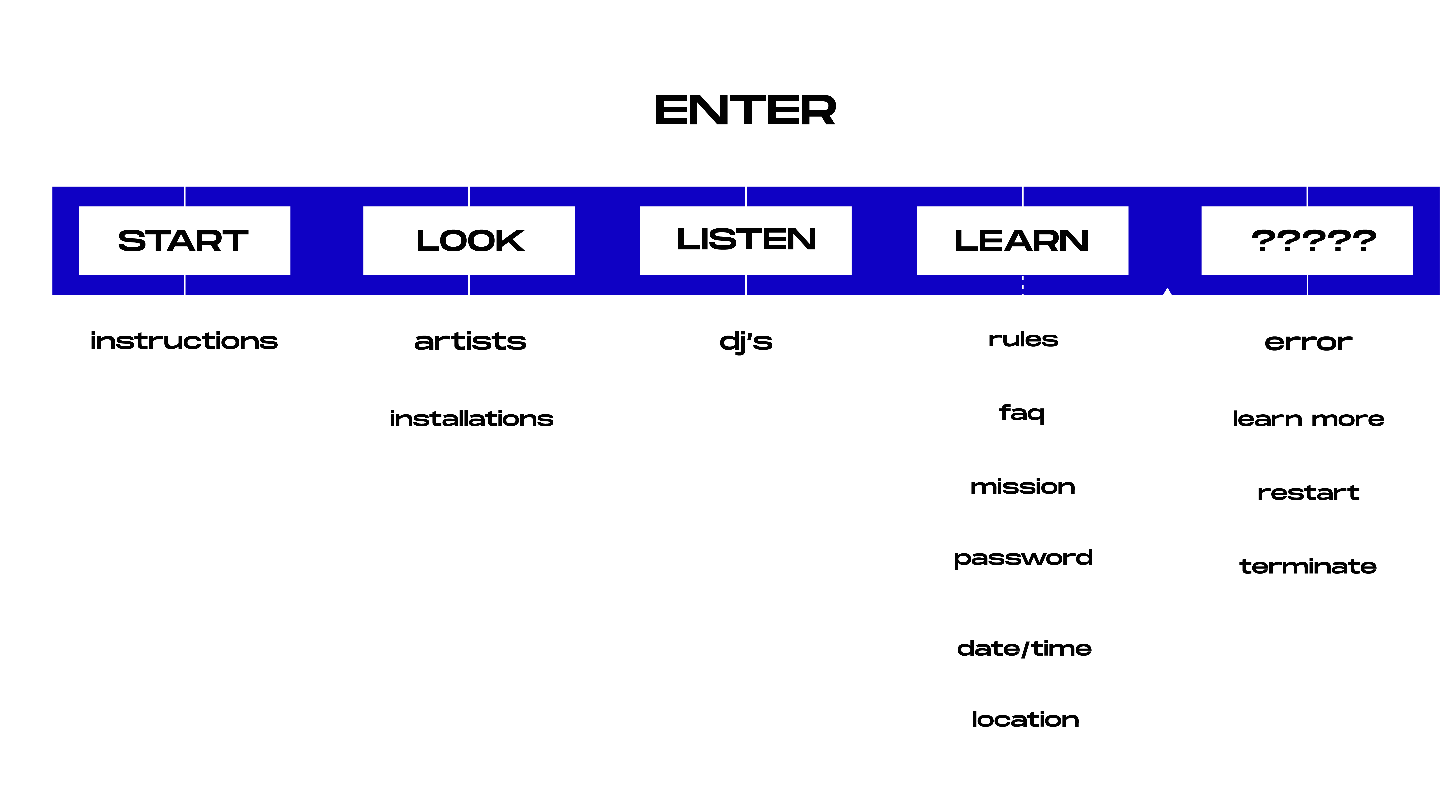
Look
Listen
Learn
| visual identity |
Brand Strategy:
Create a bold, in-your-face aesthetic inspired by electronic music
Capture the energy and electricity of an EDM (Electronic Dance Music) festival
Highlight artists and DJs as key components of the event
Showcase 404 as a one-of-a-kind artistic experience
Brand Components:
Neon color palette
Retro computer typefaces
Vibrating glitch patterns
Windows95 pixel icons

Primary Logomark
Alternate Logomarks

Color Palette
Patterns
Icons
| user experience |

User Experience/Interface Goals:
Create a memorable experience (full of surprises) that keeps users engaged
Build interactions that feel surprising yet nostalgic
Encourage the user to explore all the paths of 404
Utilize the user experience as an extension of the visual system and brand identity


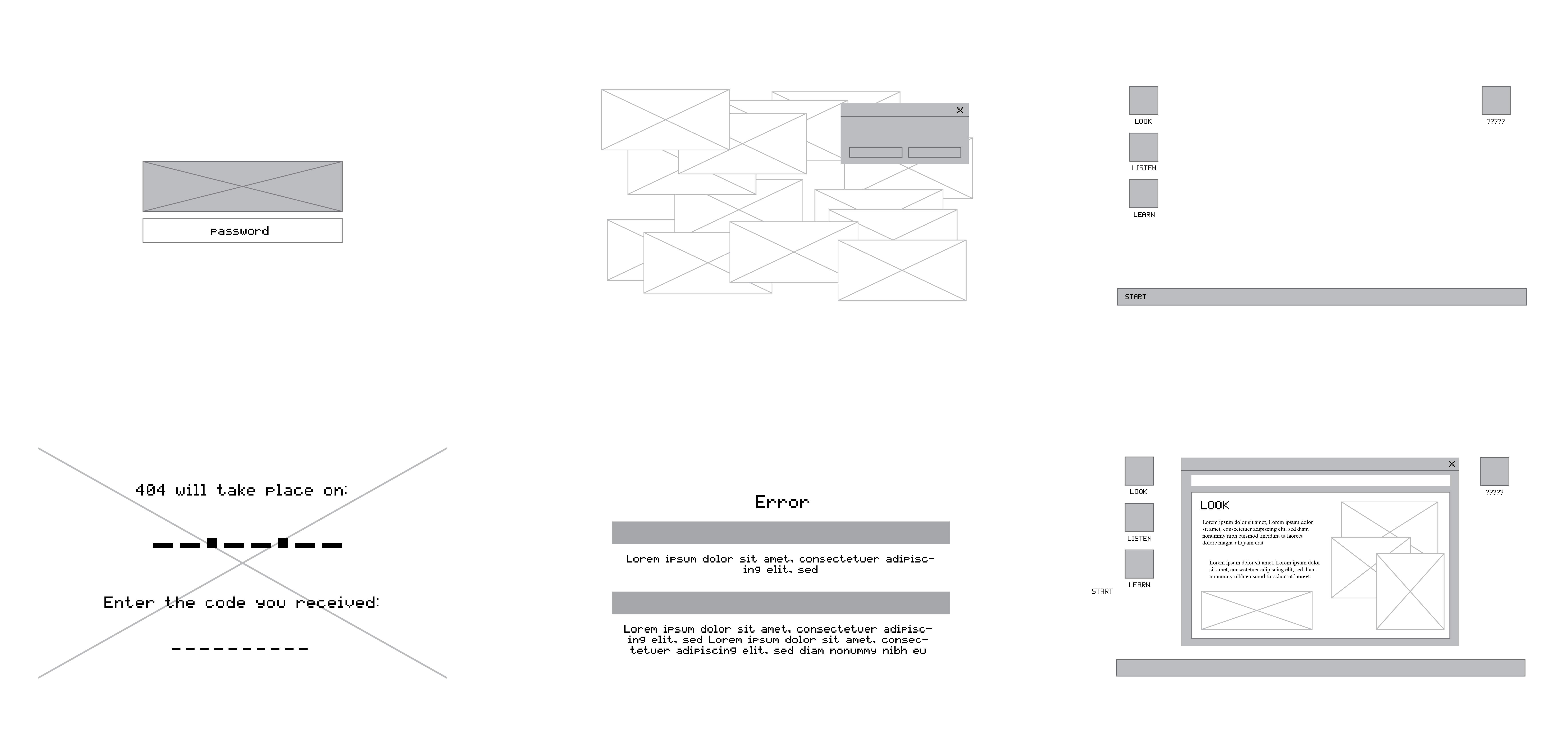
Wireframes
All Rights Reserved © Sarah Cantor 2020